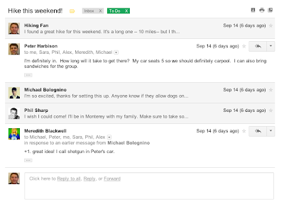
Streamlined conversations
Conversation view has been completely redesigned to help you read through your email threads. You'll now see profiles pictures for your contacts, so it's easier to keep track of who said what. We also stripped out as much as possible so you can focus on communicating with your friends and colleagues.

Elastic density
We know that you use Gmail from a variety of screen sizes and devices, so now the spacing between elements on the screen will automatically change based on the kind of display you're using. If you prefer a denser view all the time, you can change your density manually in the Settings menu.
 [...]
[...] Submit your suggestion / comments / complaints / Takedown request on lookyp.com@gmail.com


No comments:
Post a Comment